Common ways to display data: Bar chart
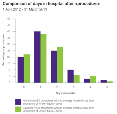
Use bar charts that are bright and easy to understand, for example, the bar chart below shows the number of days spent in hospital (0-5 days), comparing the average length of stay after a procedure carried out by a particular consultant (purple bars) with the national average length of stay for that procedure (green bars).
Question:
Using the bar chart, which length of stay is most common?
Click below to check your answer.
Incorrect. Please try again.
One day in hospital is most common. All other bars are shorter.
Incorrect. Please try again.
