Common ways to display data: Benchmarking
National quality improvement projects provide reports which show relative performance, known as benchmarking.
Reports on national quality improvement projects, such as national clinical audits, present similarities and differences in practice between organisations.
Comparisons of quality of care provided between healthcare organisations help to identify best practice which can then be widely shared.
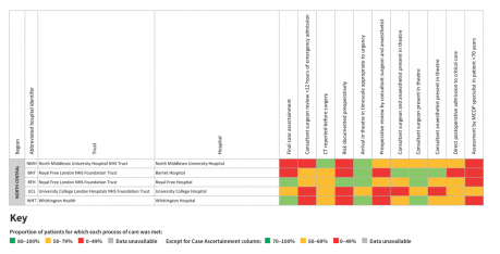
This table shows the percentage of hospitals meeting each step of care listed, for emergency admissions, across the North Central region of England.
For example, it can be seen that four of the five hospitals have a red box for ‘Risk documented preoperatively’. This shows that the proportion of patients for which this process of care was met was 0-49%.
Red, amber and green (RAG) or ‘traffic light’ colours are often used to show compliance with standards at a glance, with red signifying a warning, moving towards green signifying safety (though only 100% compliance is usually truly safe).
